
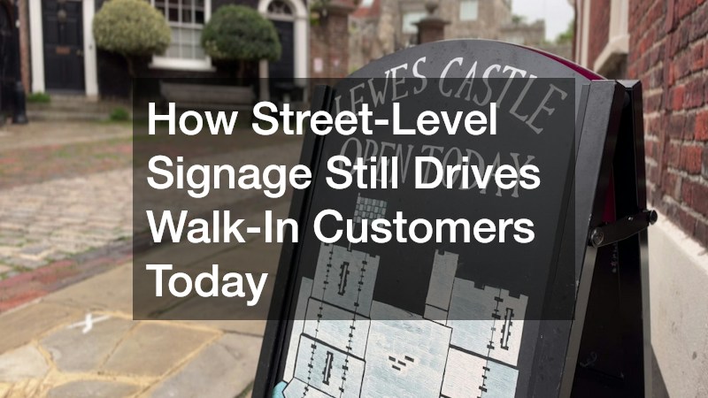
Even in a world of online reviews and GPS directions, the first real impression most customers get of a business is still its sign out front. A cluttered, outdated, or hard-to-read sign can quietly cost a shop foot traffic every single day, while a clear and well-placed one keeps pulling people in without any extra ad spend. If you are trying to figure out why some storefronts always seem busy while others struggle to get noticed, the answer often starts above the front door. This article breaks down exactly how street-level signage continues to shape buying decisions and what to look for when evaluating your own.
Why Passersby Still Notice Physical Storefronts
Most consumers decide whether to enter a store within a few seconds of seeing its exterior, and a huge part of that snap judgment comes from the sign itself. Unlike a digital ad that can be skipped or ignored, a storefront sign is seen by every single person who walks or drives past, whether they were looking for your business or not. This constant, repeated visibility builds familiarity over time, which research consistently shows increases trust and willingness to try a new place. A sign that is legible, well-lit, and positioned at eye level does more heavy lifting than many business owners realize.
Foot traffic patterns also matter here. A sign that works well on a quiet side street may be completely ineffective on a busy avenue where people are moving quickly or driving by at speed. Understanding how people actually experience your block, including sightlines, traffic speed, and pedestrian density, helps determine what size, height, and style of sign will actually get noticed.
How Design Choices Influence Walk-In Decisions
The way a sign looks communicates a message before a customer ever reads a single word on it. Color, font, and layout all send subconscious signals about what kind of experience awaits inside, and mismatched signals can actually push people away even if the business itself is great. A bakery with a sleek, minimalist black-and-white sign might unintentionally suggest a cold, corporate space rather than a warm, inviting one. Getting the design right is less about personal taste and more about matching visual cues to customer expectations.
- Bold, high-contrast colors improve readability from a distance
- Simple fonts are easier to read quickly while walking or driving
- Consistent branding across signage and storefront builds recognition
- Lighting choices affect visibility during evening and early morning hours
- Material and texture can hint at price point and quality level
What Makes Signage Easy to Read at a Glance
Readability is one of the most overlooked aspects of effective signage, yet it directly determines whether someone can process the information in the few seconds they have. Text that is too small, too stylized, or crowded with excessive detail forces people to slow down or squint, and most will simply give up and move on. The goal is always clarity first, personality second, because a sign nobody can read is not doing its job no matter how attractive it looks.
Spacing and placement matter just as much as the words themselves. A sign mounted too high, too low, or obscured by trees, awnings, or parked cars loses much of its value regardless of how well it was designed. Many local sign businesses now offer site assessments that account for these real-world obstructions before any design work begins, which helps avoid costly reprints or relocations later.
Why Local Regulations Shape Signage Options
Most cities and municipalities have specific rules governing the size, lighting, placement, and sometimes even the color of exterior signage, and these rules vary significantly from one jurisdiction to another. Ignoring them can lead to fines, forced removal, or lengthy permit disputes that delay a business opening or rebrand. Understanding local codes early in the planning process saves time, money, and frustration down the road.
- Historic districts often have stricter rules on materials and illumination
- Some areas limit sign size based on storefront width or zoning type
- Permits are frequently required before installation can legally begin
- Illuminated signs may face additional restrictions in residential-adjacent zones
- Temporary signage, like sandwich boards, often has its own separate rules
How Seasonal Updates Keep Signage Relevant
A sign that never changes can start to blend into the background for regular passersby, even if it was eye-catching when first installed. Small seasonal updates, like a banner promoting a holiday sale or a new feature product, give returning customers a reason to look again and can create a sense of timeliness around the business. This approach also signals that the business is active and attentive rather than static or forgotten.
Rotating signage elements do not need to be expensive or complicated to be effective. Simple changes like swapping a window decal, adding a seasonal color accent, or updating a sandwich board message can refresh the overall look without requiring a full redesign. The key is consistency in timing, so customers come to expect and look forward to these small refreshes.
When It Makes Sense to Upgrade Your Sign
Signs naturally wear down over time due to sun exposure, weather, and general use, and a faded or flickering sign can quietly damage a brand’s credibility even if everything else about the business is thriving. Cracked plastic, peeling paint, or burnt-out letters suggest neglect, and customers often assume that same neglect extends to the products or service inside. Periodically stepping back and viewing the sign as a first-time visitor would is a useful exercise for catching these issues before they affect sales.
Upgrading does not always mean starting from scratch. Sometimes a fresh coat of paint, updated lighting, or a modernized font is enough to revive an existing structure without the cost of a full replacement. For businesses considering a bigger change, taking time to compare materials, weigh energy-efficient lighting options, and research how different finishes hold up in direct sun can go a long way toward making sure the final result lasts and continues to draw attention for years to come.
Street-level signage remains one of the most reliable, cost-effective tools for attracting walk-in customers, even as digital marketing continues to grow. The businesses that thrive are usually the ones paying close attention to visibility, design, legibility, and upkeep rather than treating their sign as a one-time decision. Take a fresh look at your own storefront this week and consider whether it is genuinely working as hard as it could be. Small, informed adjustments now can translate directly into more foot traffic down the line.
