Rhythm, for sure, is a familiar concept to you, just not in the concept of decorating a home. As this element makes a song ‘flow’ seamlessly from the first verse through the chorus and the bridge, rhythm does relatively the same in interior design. It moves the eyes through the space in an organised way and ties all the elements together that the entire style becomes one cohesive, united whole. A room then doesn’t look like it’s put together at random. Every feature is deliberate, contributing to better aesthetics of the entire design.
There are plenty of ways to achieve rhythm in the space. Here are the principles to remember:
Repetition
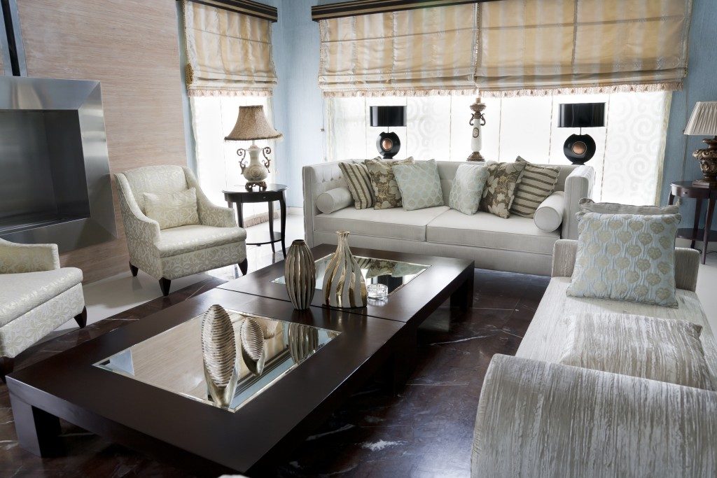
Recurrent elements throughout the space can form a pattern that connects one space to another. Colour is the commonly repeated design feature. Pick one colour in your palette, preferably your accent hue, and use it in different areas at your home.
If you’ve used red on throw pillows in the living room, you can also use it in the vases in the kitchen or the upholstery fabric of chairs in your dining area. You may also use repetition in terms of texture. If you’ve used sheepskin rugs in the family room, have a throw blanket of the same material on your bed or on your luxury armchairs. All these common elements in different areas of the room can trigger a sense of familiarity to people entering the space, improving unity in design.
Contrast
When you pair elements that are in direct opposition to one another, you’re encouraging the eyes to move back and forth those objects. Think about a bedroom full of white walls then having a black door popping out on one of them or a steel fireplace placed at the center of a wall accentuated with wooden planks. Go back to your colour wheel and see which opposing hues you can use.
Explore different materials with different finishes. For you to go for the black internal doors, Australia-based interior designers highly recommend using it as well for the facade of your home. It will boost your home’s value so much greater than you can expect.
Gradation

This method allows the eyes to shift from one end of a space to another through progression. The stairs are the classic example here. Their structure and shape move the eyes from one floor level to another. To highlight the progression better though, use vertical geometrical patterns on the planks. This doesn’t just achieve rhythm, but also create a visual interest in an otherwise-plain space.
Apply gradation in the colour scheme, too. The recently trending ombre palette guides the eyes as well, as it changes from light to dark hue. If you have a long and narrow wall, like corridors that separate bedrooms from the family room, an ombre palette not only guides the eyes towards the farther end of the hallway, but also moves the focus away from the narrowness of the space.
Look at your current home design and see if your furnishings, fixtures, decor, and everything else help the eyes move toward one feature to another. If it doesn’t — or if you think there’s something lacking in the space, but can’t quite put a finger on it — then it’s high time to add rhythm in your style.